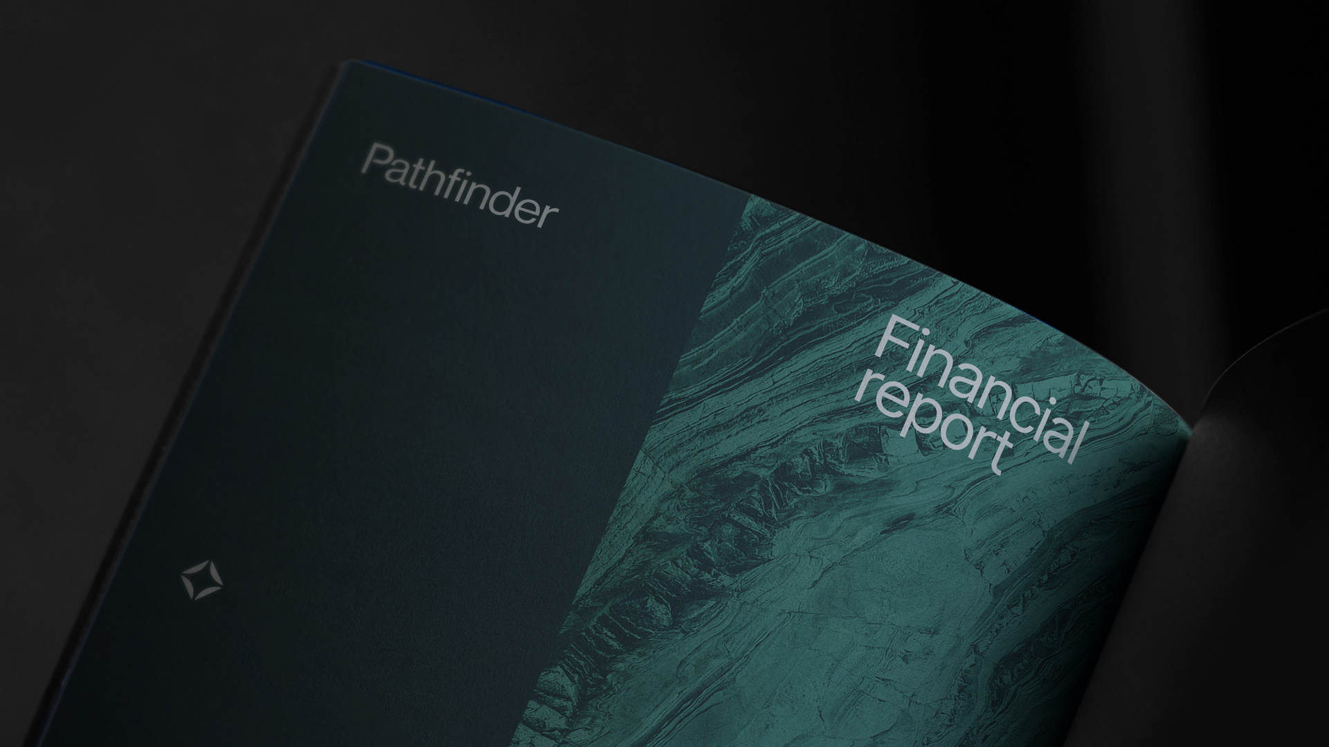
Pathfinder
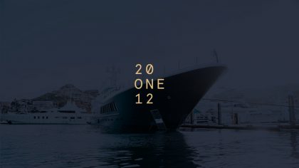
Twenty One Twelve is a marketing agency for high-end brands that had quickly established itself in the luxury sector. We helped evolve its brand identity to better align with its upmarket positioning and reinforce its profile with discerning clients.
Twenty One Twelve recognised that its existing brand identity wasn’t living up to its upmarket credentials or showcasing the creativity that clients expected. The challenge was to create an identity that would convey the agency’s heritage, aspirations and capabilities whilst demonstrating the lateral thinking that defined their approach.
Our solution began with the agency’s origins: the river town of Henley and the 2,112-metre distance of its famous royal regatta races. By incorporating these distinctive distance marker numbers into the new logo, we created a unique identifier that honoured the brand’s heritage whilst establishing a more memorable visual presence.
To replace the straightforward linear approach of the existing logo, we selected Apercu Mono—a mono-spaced font that creates a distinctive grid-like logotype. This systematic approach offers both structure and versatility, allowing letters and numbers to be interchanged within the grid design for various brand extensions.
We paired this contemporary approach with Caslon Pro, a classic serif that adds gravitas and sophistication to the overall system. Rather than defaulting to the traditional gold and black palette common amongst luxury brands, we created a subtle balance of soft brass and deep river blue, accented with bright pistachio and coral to highlight the agency’s core digital services.
By taking Twenty One Twelve’s former one-dimensional logo in a completely new direction, the transformation resulted in a more characterful and visually interesting logotype alongside a comprehensive and versatile brand identity system: one that is much more in keeping with the luxury space it occupies and, just as importantly, flexible across all of its digital and print touchpoints.
Delivered
— Brand strategy
— Brand identity
— Brand development


"Working with Craig was an absolute pleasure and I wouldn’t hesitate to recommend him to anyone who wants excellent design work. The depth of detail he goes to is impressive which I would say is a direct result of his passion for his craft. We’re delighted with the new branding he has completed for Twenty One Twelve."
